
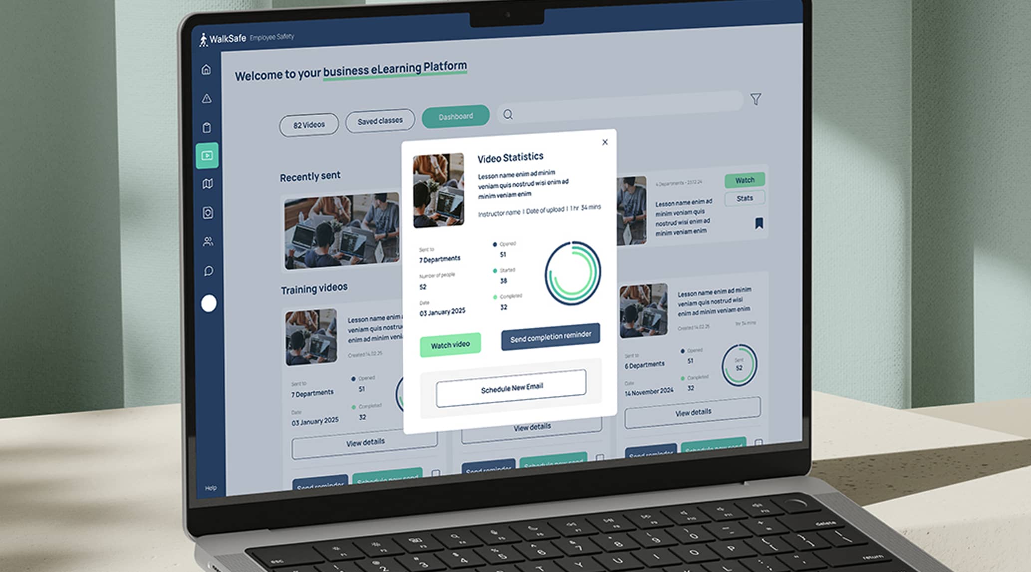
WalkSafe App & Dashboard
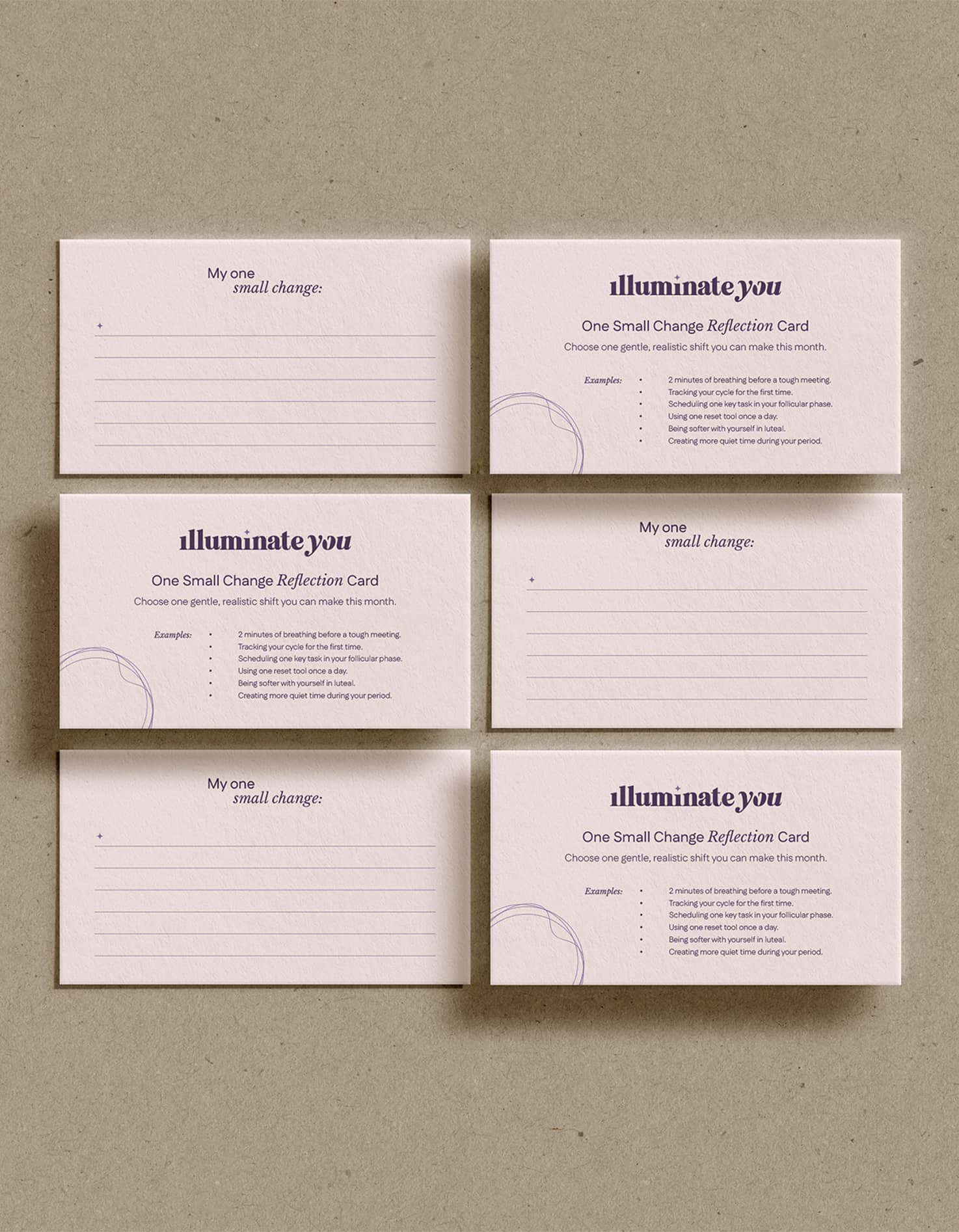
Brand identity and creative asset development for Illuminate You - a workshop-based business helping women work smarter through every phase of their menstrual cycle, rooted in biology, neuroscience, and real female lived experience.
I partnered with Illuminate You to create a clean, premium, and approachable visual identity that brought credibility and warmth to the brand, while supporting the founder in pitching her workshops to secure new clients and bookings.
The brief
The client needed support bringing her vision to life visually. She already had a strong understanding of how she wanted her brand to look and feel, and had spent a long time researching, planning, writing, and refining every part of the business before approaching me. By this stage, she had already written her workshop presentation, handouts, sales deck, and mapped out the full workshop flow - she just needed a visual identity that could bring everything together and make the brand feel real.
She really wanted to work with someone who fully understood her vision and felt equally passionate about the subject matter. She wanted the brand to feel like a soft but powerful space - feminine without being childish, scientific without being cold, premium while still feeling accessible.

The challenge
Existing brand
Established engineering business.
Strategic opportunity
Adventure-led caravan rental brand.
Creative objective
Build distinction without losing recognition.
The approach
To ensure the final identity felt fully aligned with both the client’s vision and the depth of work she had already developed, I began the project with a detailed brand questionnaire. Although the client had provided an incredibly thorough brief, this process helped uncover additional insights into her values, audience, positioning, and long-term goals, allowing me to build a more strategically grounded identity system.
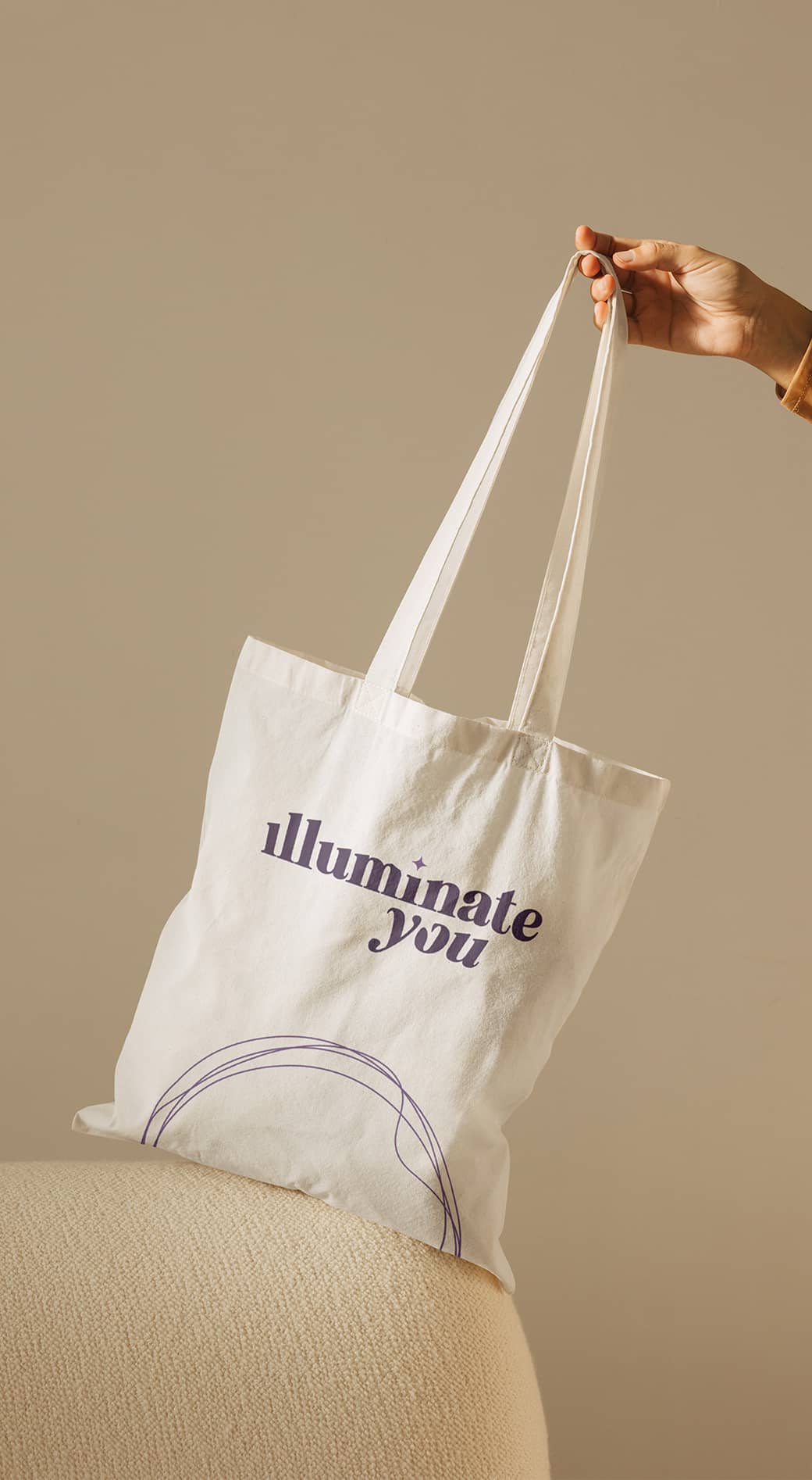
The visual direction centred around creating a brand that felt bold yet soft, premium yet approachable, and feminine without leaning overly delicate or traditional. Using a refined palette of purples and nude tones, paired with clean typography and bespoke iconography, I developed a visual identity that balanced credibility with warmth and emotion.
Once the core identity was established, the system was rolled out across sales and workshop presentations, handouts, and branded stationery, creating a cohesive and elevated experience across every client touchpoint.


Rather than positioning the business around the caravan itself, we positioned it around the freedom and memorable experiences it naturally creates.
With a clear strategic direction established, I translated these insights into a visual identity designed to feel approachable, trustworthy and adventurous without becoming rugged or intimidating. Every creative decision - from the typography and colour palette to the logo, imagery and social templates - was shaped by the strategy we had built together, ensuring the identity wasn't just visually appealing, but purposeful and aligned with the business's long-term goals.


The outcome
We worked closely throughout the project, with review calls at each major stage to ensure the identity continued to align with the client’s vision. Because so much thought and strategy had already gone into the foundations of the brand, the creative process felt incredibly aligned from the start. Seeing the client’s reaction as the brand came to life visually really reinforced the value of building a strong strategic foundation before moving into design.
.svg)
Caravan rental service

Performance athletes

Sustainable sports apparel

High-end florist

Fashion social content

Online training platform

Women empowerment workshops

Personal Shopping

Direct Mail & Email

App-like Interactive PDF

Campaign Roll Out

Dashboard & App design